

What Your Nonprofit Homepage Needs Above the Fold

A new visitor lands on your homepage from a search, a link in an email, or a friend's recommendation. Within a few seconds, they decide whether your site is worth spending more time on. Most of that decision rests on the first thing they see.
Designers call that first view “above the fold,” a term borrowed from newspapers, where the top half of the front page was the only part seen on the newsstand. On a website, it means everything visible on the screen before anyone scrolls. Five elements deserve to be in that first view, whether your website is for a nonprofit, an NGO, or a government agency.
The five elements of a strong first view
1. Say what you do and who you serve in one sentence
Many homepages open with a mission statement such as "empowering communities through lasting change." It sounds good, but it could describe almost any organization, and a new visitor is left guessing. A stronger first line says what you do, and for whom or for what.
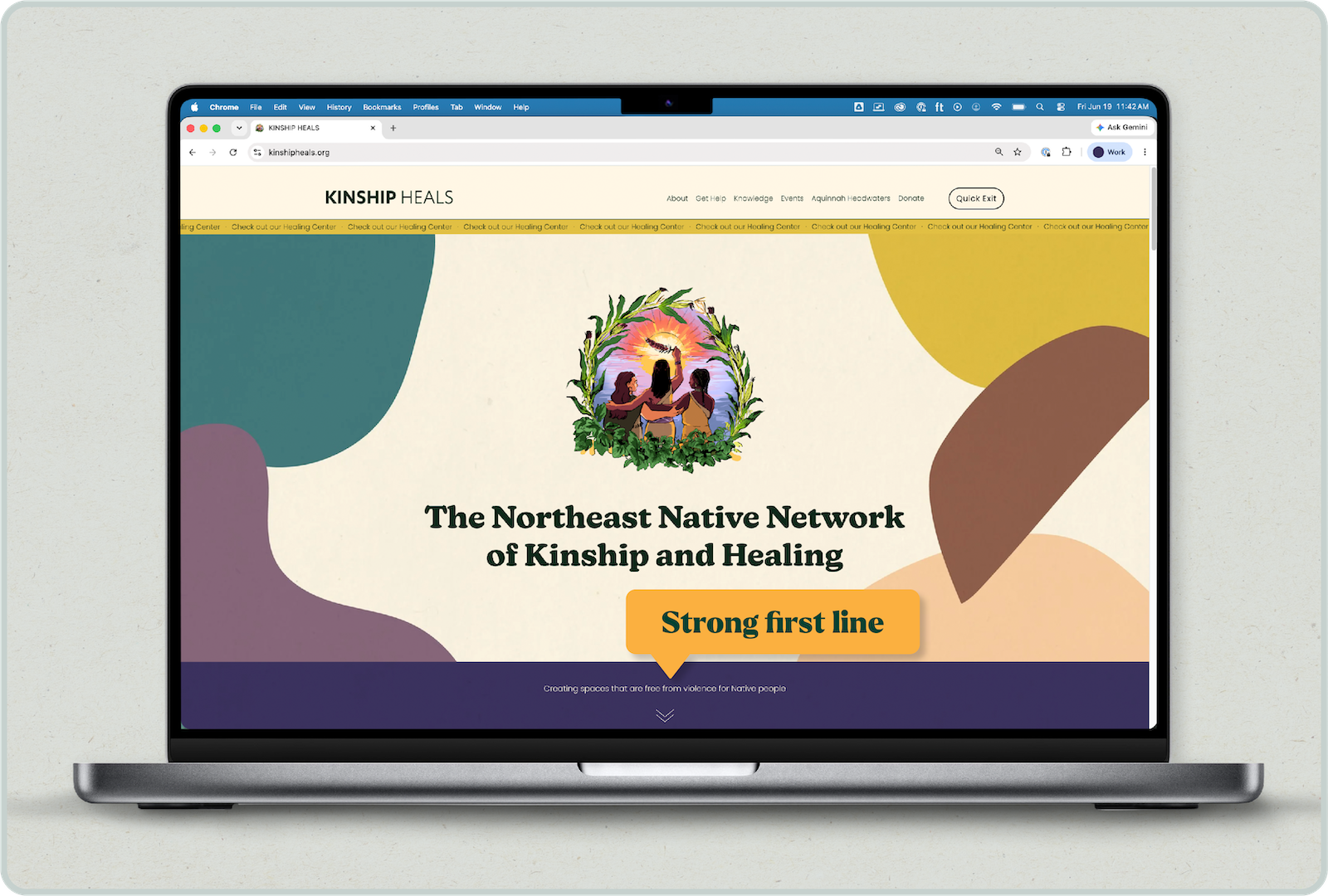
The Kinship Heals homepage is a good example. It opens with two short lines. The first, "The Northeast Native Network of Kinship and Healing," names who they are, and the second, "Creating spaces that are free from violence for Native people," says what they do and for whom. A first-time visitor has the basics before scrolling at all.
A quick way to test your own line is to read it out loud to someone outside your organization. Ask them to describe what your organization does, in their own words. If they can’t do it, your sentence needs to be adjusted.
2. Choose one thing you want them to do
For a nonprofit or an NGO, that's often giving a donation. For a government agency, it's more likely to find a service. Whatever you choose, give your visitor one clear, visible button, and let everything else live in the navigation.
The Aquinnah Headwaters homepage shows how this can work. The first screen gives visitors the action: "Donate now." When there’s fewer things to click, your visitors are less likely to get overwhelmed with options.
When the first screen has several buttons of equal weight, visitors have to choose between them, and some will make the choice of leaving your site .
3. Show one piece of proof
Proof is anything that shows your work is real, such as a photo of the work, a specific result, a track record, or facts about the key people in your organization.
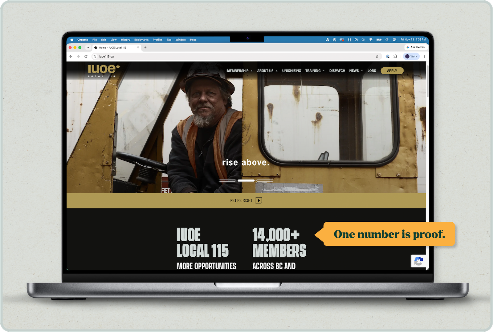
The International Union of Operating Engineers Local 115 (IUOE Local 115) homepage shows how one number can do this work. Its first screen includes "14,000+ Members," with "Across BC and Yukon" beneath it. In a few words, a first-time visitor learns how large the organization is and where it works.
4. Keep the navigation short and clear
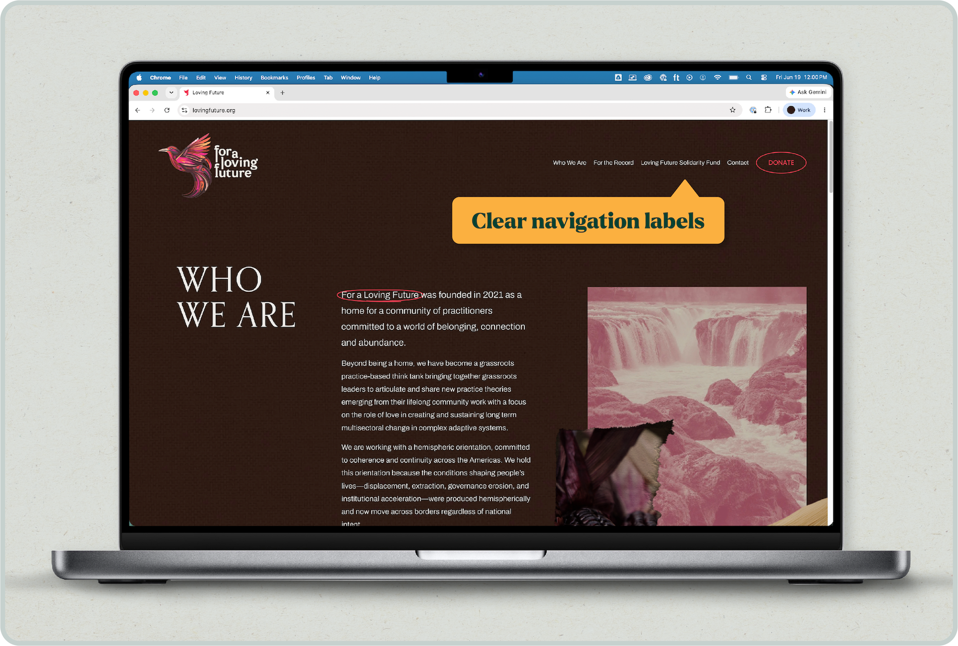
Your website navigation items should be easy to use by your visitors. Use words your visitors would use, and keep the navigation where it's easy to find (hint: above the fold). It's tempting to use your organizational structure to guide your navigation, but this doesn't help a newcomer. For a Loving Future keeps its menu short, with just four labels: Who We Are, For the Record, Loving Future Solidarity Fund, and Contact. A first-time visitor can guess where "Who We Are" and "Contact" lead, and the Donate button sits apart from the menu, so giving is easy to find without crowding the labels. Contact is right there in the menu, which helps visitors who don't want to browse and just want to reach out.
5. Make the text readable for everyone
For text to be considered readable, a few things need to be considered:
- Size: Is the text large enough to read comfortably?
- Contrast: Is there enough contrast between the text and the background?
- Layout: Does the page work as well on a phone as on a computer?
By addressing these factors, you can make sure your content can actually be read by not only your visitors, but also the support technology (like screen readers), your visitors might use.
The easiest way to check contrast is with a free contrast checker. Enter your text colour and your background colour, and it will tell you in seconds whether they pass the minimum in the Web Content Accessibility Guidelines: 4.5 to 1 for regular text and 3 to 1 for large text such as headlines (WCAG 2.2, Understanding SC 1.4.3). Do the same for any text you place over a photo, since busy background images can make words hard to read.
How the first screen changes by audience
The five elements stay the same, but the answers differ depending on who your visitors are and what they came to do.
Many organizations have more than one offering, so treat this table as a starting point. If your visitors come for two different reasons, pick the more common one for the first screen and give the other a clear place in the menu.
What to leave below the fold
News feeds, long mission statements, full program lists, newsletter signups and funder logos all matter, but visitors can find them after they've understood who you are and what to do next.
A common question is whether the fold still matters, since people scroll all the time. It does, but it sits in a different place on every device. A phone shows far less of the page than a laptop, so the fold on a phone comes much sooner. That's why the five elements above need to fit on the smaller screen. The laptop version can support more information, but no matter what the screen size is, the first screen sets the first impression.
Try it on your own homepage this week
Open your homepage on your phone and on a laptop, and look at what appears before you scroll. How many of the five elements do you see? Do you have one clear sentence, one main action, one piece of proof, simple navigation, and readable text? Chances are, you have at least a few. Most homepages need just a couple tweaks, not a complete redesign.
If you'd like a second set of eyes on yours, we'd be glad to take a look. Send us a link to your homepage and tell us which of the five feels hardest to get right.